What are Two Frame Films
The idea behind Two frame films originated from the photographer Luke Fowler's 'Two frame films' book that he published. 'Two frame films' is the concept of placing two images side by side to create meaning behind the connection of the images. The point behind 'two frame films' is to pair a set of photos together and allow the viewer to create a link between these photos and find a meaning that they believe in. I think this concept is really interesting because it doesn't rely on the photographer to simply lay out what the meaning behind the pair of photos is and instead makes the viewer think for themselves. These sets of photos would sometimes have a clear connection to each other and other times you would struggle to make any sense of the photos since at first glance it may seem like there is no correlation whatsoever. Fowler has always been involved in the world of photography, however, he originally began by using half-frame cameras.
|
|
Montage Theory
Montage theory is the idea of connecting certain images together to express complex ideas.
This idea is used to showcase history and experience as a everlasting conflict in which a force (thesis) collides with a counterforce (antithesis) to produce a new event (synthesis).
This idea is used to showcase history and experience as a everlasting conflict in which a force (thesis) collides with a counterforce (antithesis) to produce a new event (synthesis).
Osma Harvilahti
|
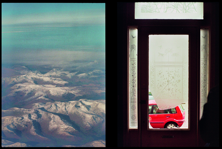
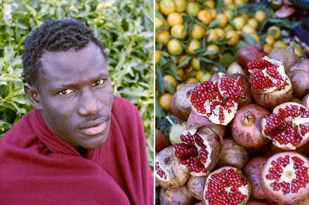
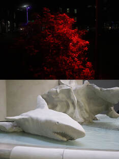
Osma Harvilahti is a photographer who has created a set of diptychs that are linked together through the use of tone, colour, and shape. This is fascinating to me because it makes the viewer think about the connection between the photos. This diptych is a good example of how the photographer makes the viewer create connections between two completely separate photos. The colours used in the photos are what connect them since they both have a red focus in the foreground and some greenery in the background. Both of these photos create a similar mood despite having completely different subjects. This is due to the calculated similarities between the photos like the lighting and colour.
|
Mike Terry
|
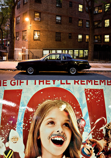
Mike Terry has created a sequence of diptychs using a set of different strategies. Some of his images seem to be related by a common event or quality of light whilst other pairs have contrasting viewpoints which are created by juxtaposing colour, subjects, and moods. As a result, his pairs of images cause tension which can cause a reaction from the viewer. I have to say that his way of creating tension in his photographs is fascinating to me because highlighting the contrasting features between images is a very basic but effective way of creating tension which I plan to embed in my work in the future. It seems to me that some of Terry's diptychs relate to each other a lot more than others. For example, the diptych on the left has almost no similarities at first glance. This is because the first image captures the outside and focuses on a car. On the other hand, the second image focuses on a girl on the front page of a magazine that does not correlate a car whatsoever. However, the longer you look at the diptych you begin to realize that the similarity between the image is the event that is taking place. In this case that would be the Christmas holidays as the first image captures the streets during Christmas time whilst the second image is a Christmas themed magazine. The fact is that images can juxtapose each other in visual elements and can still relate to each other through other aspects such as a common event.
|
|
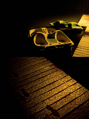
Terry also focuses on creating a common ground in his diptychs by focusing on more visual aspects such as colour, lighting, and subjects. The diptych on the right has a pair of images that have been taken at the same time of day since the lighting is very similar. Also, Terry has made sure to keep the colours consistent between the two photos to create clear similarities between them. On the contrary, the diptych on the right shows a dock from two different perspectives. The first image is taken from a more open perspective so that the viewer can get a clear view of the boats. In contrast, the second image is taken from a close-up perspective of the dock itself which allows for the viewer to see the minor details in the scene such as the footprints that have been left behind. This type of diptych is effective because at first glance they seem to be very similar due to their obvious similarities in visual aspects, however, the longer you look at the diptych the faster you realize the differences that allow for the viewer to piece together the scene as a whole.
|
|
John Maclean
|
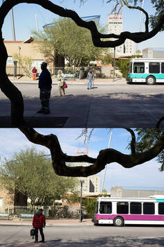
He labels his series of diptychs 'Two and Two' which he presents a pair of photos side by side. John Maclean likes to experiment with diptychs by lining up two photos so that he can create an illusion that the images are linked. I like this idea because it makes his photos seem less random and more coordinated. The idea behind his diptychs is that he wants his viewers to see diptychs in a way that reflects the way people see the world with two eyes and not one. I feel like he has conveyed this idea clearly through his diptychs because he places two images that parallel each other side by side. These images resemble each other because they have been taken in the same place. Although both images are of the same place he includes differences so that he can highlight the different ways people can see the same place. This links back to his original ideology of how people see the world with two eyes and not one because he has shown that the same place can be viewed differently if minor changes like positioning are made.
|
|
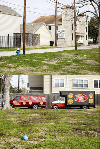
The main concept behind his diptychs is that he goes out of his way to capture a place twice. For example, this diptych shows the outside of someone's house from a frontal view and a side view. In this instance, Maclean has decided to capture the scene at the same time of day to place the viewer's attention on the less drastic differences. This is done to convey a sense of similarity whilst still allowing for either photo to create a unique atmosphere. It is clear that he wants to highlight the differences between the photos, to do this he adds different elements such as the vans outside to create a completely different view of the place whilst not relying on simple elements such as the time of day. As a result, the first photo suggests that he visited a peaceful and open neighborhood that doesn't have much activity. In contrast, the second photo suggests that he captured a noisy neighborhood that has people coming in and out of it. This is because the first photo makes the place seem open and empty due to the lack of vehicles/people and the open-angle that the photo is taken from. On the other hand, the second photo has vans which imply that people are active, the cramped frontal view makes the place feel crowded. Overall, I think that Maclean did an excellent job of expressing the idea that people see the world with two eyes and not one.
|
|
My Response
|
|
These are my Diptychs that I had made based on the idea of randomization because I wanted to create an image that made the viewer question why these two photos were placed together. This was because I wanted the viewer to create their own story that linked the two photos together instead of relying on the photos to simply lay out the story in front of them. Overall, I am satisfied with the outcome of my diptychs since I feel like if you were to look at my set of photos for long enough that you would be able to picture a scenario where these two scenes relate to each other.
|
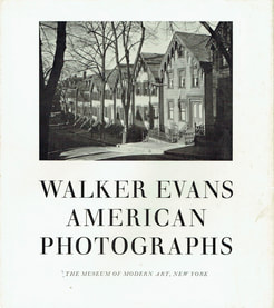
Walker Evans, American Photographs
|
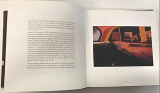
Walker Evans is a photographer who was known for publishing the photo book called 'American Photographs' in 1938. This photo book had a major influence on photography itself and was considered a piece of art. The exhibition for the book was held in The Museum of Modern Art in New York. The pictures were laid out in a order like a set of words that make a sentence which gave his work meaning. The first section focuses on American society by capturing images of the people that its made of. The second half focuses on American architecture such as the factory towns, main streets, rural churches and wooden houses.
|
William Henry Fox Talbot
|
|
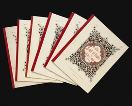
Talbot distributed large editions of photographic prints. Nicolaas Henneman was supported by Talbot in the development of a photographic printing establishment in reading, a town on the route between London and his home in Lacook. Talbot's pencil of Nature was the first commercially published book illustrated with photographs. The pencil of nature contained twenty-four plates, a brief piece of text for each and a intro. He wanted to display his photos in a photography book because it allowed him to document his photos and allowed him to go back and view the minor details in his photographs.
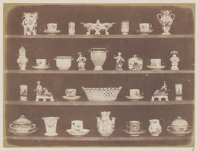
Anna Atkins
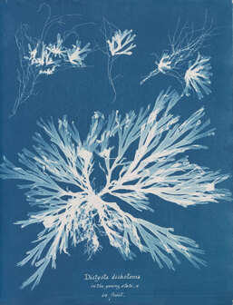
|
Anna Atkins is known to be the very first female photographer who was well known for her books about plants. Her books stood out because they involved photographs that were paper treated with salt and a solution of silver nitrate. She had an interest in the cyanotype printing process which produced images through sun-printing. To achieve this you must place objects on paper that has been treated with ferric ammonium citrate and potassium ferricyanide, next, you expose the paper to sunlight and then wash everything off with water. This will reveal an image that is made of uncovered areas that have turned dark blue, this process is known as blueprinting. This technique was used to create her iconic piece of work called Photographs of British Algae: cyanotype impressions which was created in a very limited quantity, only 13 books were known to exist.
|
How they impacted photo books
In conclusion, I believe that William Henry Fox Talbot and Anna Atkins both played a major role in the development of the photo book and I believe that we can learn a lot from their practice. Firstly, Anna Atkins is claimed to be the first female photographer and was responsible for Photographs of British Algae: cyanotype impressions which was considered the first book to be published that offered photographic images. This shows that Anna Atkins played a major role in the development of the photo book because she was one of the first people who involved themselves in the idea of a photo book. On the other hand, we have William Henry Fox Talbot who published one of the earliest photographic books that involved twenty-four calotypes with text. Talbot was aware of the potential of photography and books that involved photographs which is why he played a key role in its development. In the end, they both created their photos using different methods but they both managed to see the potential of photo books which is why they were both able to play a key role in its evolution.
Photozines
Eleven Privatised Public Assets
This is a zine that documented privatised areas through a collection of photographs from a birds eye view. What I really like about this zine is that it captures areas from a very high point which allows for us viewers to get a clear idea of what the area is like. I have to say that these photos are really appealing to me because of how they are taken from a birds eye view which enables me to see all the separate houses, power stations and the roads that connect everything together. It seems to me that the location was captured from such a high point to create the illusion that everything is miniature since when I look at these images I get the impression that everything is tiny because of how zoomed out it is. Overall, I found this zine very amusing because of how it took a unique approach to photography by capturing the scene from an absurd height.
My Favourite Pages


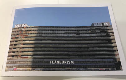
Flaneurism
|
This is a zine that documented the poor conditions of a housing estate. I found this book really fascinating because of how it focuses on the negative aspects such as the graffiti, litter, mold, etc. The reason i find this so fascinating is because it allows us as viewers to imagine what living in these conditions are like. As a result, this allows me to visualize the type of living environment that people have to deal with which I believe was the main focus behind the creation of this zine. My favourite page included a wall with graffiti because it highlights the lack of care that is shown towards these housing estates.
|
My Favourite Pages


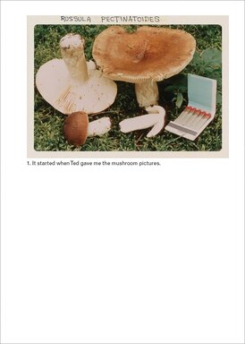
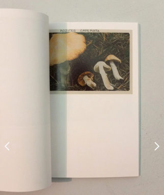
The Mushroom Collector
|
|
|
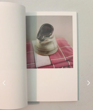
This book started when a photographer named Jason Fulford found a set of photos of mushrooms at a flea market. He formed his photo book by combining the set of mushroom photos with his own photos and text. Firstly, I really liked how he decided to make his book small because it makes me believe that someone was carrying this book on them whilst collecting and documenting mushrooms. Also, I like that he decided to leave some space beneath the photo for his cover because it allows the viewer to completely focus on the cover image without being distracted. What stood out to me when viewing his photo book was how his images didn't have any connection with the photos from the flea market. I believe the photographer was trying to make it clear that the photos of the mushrooms were taken by a different photographer and that their style of photography had no connection. The work feels amateurish because the main focus of the book are photos of mushrooms taken by an unknown photographer, Fulford was aware of this because he mentioned that the photos he picked from the flea market were likely from an amateur photographer so he intended the book to look amateurish. Fulford kept one photo per page when laying out his images in order to allow the viewers to fully take in each photo without any distractions like what he did with the books cover.
Constructions
|
|
|
|
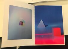
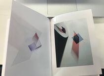
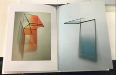
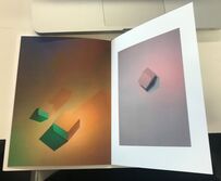
Constructions is a photography book made by Monika Drabot which focuses on three dimensional shapes. The photos focus on the shadows created by geometric shapes. One aspect of all her images are that they are all vibrant and some of the colours she uses in her images have a strong contrast which complement each other. Personally, I like how she focuses on how colours bounce off geometric shapes because of how surreal it is, for instance, you would never see anything like this if it wasn't set up by someone so viewing her photo book was a unique experience for me. What stands out to me is the 3D shapes because of the way the lights interact with them forming intricate shadows. I don't believe that there was a deep meaning behind the making of this photography book but instead was based around a simplistic idea which was to highlight how fascinating lights and shadows are when applied to the right objects. For the page layout the photographer has decided to leave some images with some extra space around the edges whilst others were blown up to fit the full page. I believe this was done in order to avoid the book becoming repetitive which I believe was a success.
Photo Layout
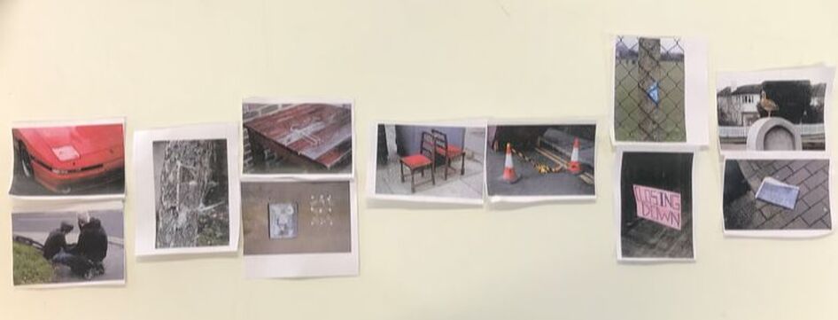
These images were organised in a way that told a story of the trouble of transport. The story starts off with the individual getting ready for the day. I thought this because the first set of images are related to household items as it shows a chair and a clothing hanger. I visioned these set of photos from the individuals perspective. The next photo is of a car which I believe is focusing on transport and the next two photos beside it work as a barrier which links to the sign which says "closing down", I decided to pair this with a photo of two cones blocking the road. The idea here was to highlight that the roads were blocked off. This sets up the photo of the bicycle as it is another form of transport, however, I paired this with a photo of a broken object to amplify the idea that the bike is broken which makes the individual a sitting duck which is the final image.
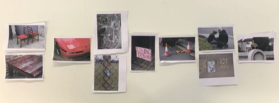
For my second layout I wanted to connect my images through common focuses, for example, the first two photos are connected because they are both focusing on forms of transport. I also placed the image of chairs and cones together as they are both pairs of an item.
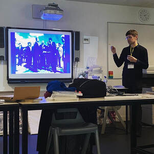
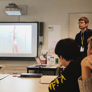
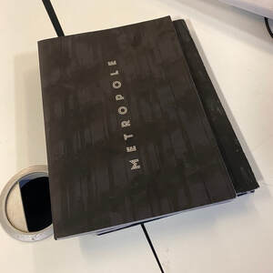
Lewis Bush-Metropole
|
|
|
Lewis Bush had visited our class to talk about his experiences in using photo books and the work he has produced. What caught my eye was his photo book called Metropole, this book captured London from when it was once known as the metropole or 'mother city'. The book mainly focused on the idea of how London is constantly changing by presenting the city as a dystopia. This was achieved through using double exposure to layer buildings on top of each other in order to distort the photos and present London as gritty and threatening. I found the cover for his book very fascinating because of how he decided to lay out his text, the text is positioned vertically highlighting the verticality of the skyscrapers. Furthermore, the cover of the book is only made of blacks and whites which is done to reflect the lack of colours in his set of photos.
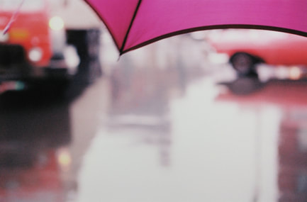
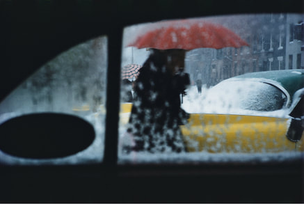
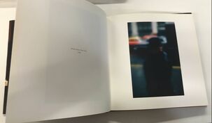
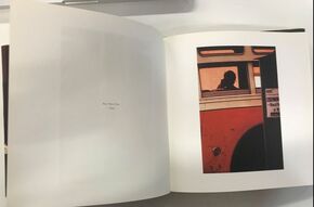
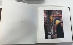
Saul Leiter
|
Saul Leiter is a photographer who focuses on capturing the atmosphere by focusing on colour and taking his photos in shallow focus. He achieves a good balance is his photos by capturing colour obstacles in focus whilst leaving the background out of focus. This is done to create a first-person effect as people focus more on whats in front of them instead of what is around them. In his images he captures obstacles such as umbrellas, taxis and windows in order to highlight how people are only focusing on themselves and don't take acknowledge whats around them.
|
|
|
Whilst viewing Leiter's work I decided that I wanted to create photos that had a similar goal which would be capturing the atmosphere of a location through the use of colours. I find Leiter's work appealing because of how he uses shallow focus to isolate the focus in his photos to emphasize how people become tunnel-visioned in the active city. Furthermore, this allows us viewers to imagine the atmosphere created from these locations. In future photo shoots I want to experiment with taking photos in shallow focus whilst also focusing on colours that stand out to me.
|
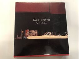
Saul Leiter-Early Colour
|
|
|
This book was a collection of photos taken by Saul Leiter called Early Colour. This book presented Leiters remarkable collection of colour photos to the public. Leiter's aim when taking these photos were to capture the colours of New York which intrigued me because I have an interest of capturing all the colours that spill into the streets. What makes Leiter's work fascinating to me is how he is interested in capturing beautiful photos, however, he is also not afraid to capture the ugly side of New York. This book had a big impact on me as a photographer because it made me realize that I need to begin to take more gritty and bizarre photos since currently I believe that I am not being very experimental with my photos. I would be more than happy to pick up this book again as I think I can still learn a lot from Saul Leiter due to the way he tackles photography.
"Being ignored is a great privilege. That is how I think I learned to see what others do not see and to react to situations differently. I simply looked at the world, not really prepared for anything."
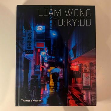
Liam Wong-TO:KO:YO
|
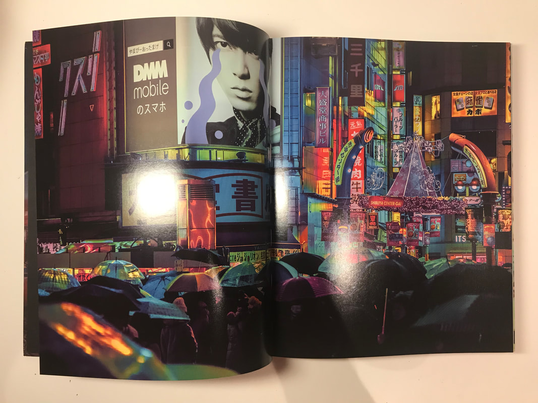
TO:KO:YO is a photo book that captures Liam Wong's perspective of Tokyo during the night, the book captures late-night taxi rides, rain-soaked streets and swarms of umbrellas shielding people from the rain. He intends to capture the city as it has rarely been seen, through the lens of a image-maker and art director. He reinvents Tokyo into a cyberpunk city where all the neon-lights reflect off the wet surfaces. Liam Wong focuses on colour similarly to Saul Leiter, however, he takes it to a whole new level by drowning his images in neon-lights. I really like the cover of the photo book because of how there is one person walking down the neon-lit alleyways of Tokyo since it highlights that this book is from one persons perspective. Furthermore, I like the choice of text for his cover because of how it is made completely out of straight lines which is done to amplify the idea that Tokyo is a futuristic city. Wong's use of colour, content and composition play a key role in the imagery within TO:KO:YO. In most of Wong's photos they tell a story, for example, the photo of the crowd all holding umbrellas could be showing workers trying to get home from a long day of work. This allows for viewers to look at his photos for longer since they provide an insight of the lives of people who live in Tokyo. Wong takes his photos using a digital camera which I believe reflects his intentions accurately as he is trying to capture Tokyo as a futuristic city so relying on the latest technology seems suitable. I am fascinated by Wong's precise placement of picture elements because everything is so well-placed that I believe his outings are planned, however that's not the case he just has very good timing.
|


|
This photo book has had a major impact on me as a photographer because it has influenced the way I take my photos and has also taught me different editing techniques that can be used to create mood in photos and I plan to use this knowledge when developing my photo book. I believe that even though the colour is the first aspect that most viewers notice when viewing Wong's work, I still personally believe that his composition in his photos is by far what makes his images so great. I have gained a lot of new ideas from his book and they have stuck with me after I finished viewing it. I definitely plan to go through his book again as it is my favourite photo book that I've viewed so far.
|
"As daylight ascends, Tokyo's neons fade away. A new day begins as the city stirs. I capture a final few fleeting moments before returning home."
Techniques for manufacturing photobooks
Japanese Bookbinding
DIY Japanese Bookbinding Tutorial | 4-Hole | Sea Lemon
□ Subscribe + ring the bell for more vids: http://bit.ly/SLDIY □ Support on Patreon: http://patreon.com/sealemon □ Become a Member: http://bit.ly/SLSpo In th...
My first manufacturing method that I may use for the production of my photobook is called Japanese bookbinding. I find this type of binding stylish as it makes the book look neat whilst keeping a handmade aesthetic. The main issue with this type of binding is the difficulty as it requires me to know how to sew. Furthermore, I will need to gather the resources necessary to use this type of binding such as a sewing kit.
Kettle Stitch Bookbinding
DIY Kettle Stitch Bookbinding Tutorial | Sea Lemon
♡ Subscribe + tap the bell for more videos: http://bit.ly/SLDIY ♡ Support on Patreon: http://patreon.com/sealemon ♡ Support on YouTube: http://bit.ly/SLSpo H...
Kettle stitch bookbinding is my second manufacturing method that I may use for the production of my photobook. I am considering using this type of binding because it allows for the book to stay flexible and lay flat which will allow viewers to see my full images which is important to me. This type of binding also requires me to know how to sew and I will need to have access to a sewing kit in order to use this manufacturing method.
Case Bookbinding
DIY Hardcover Book | Case Bookbinding Tutorial | Sea Lemon
♡ Subscribe + tap the bell for more videos: http://bit.ly/SLDIY ♡ Support on Patreon: http://patreon.com/sealemon ♡ Sponsor on YouTube: http://bit.ly/SLSpo I...
Lastly, I have researched case bookbinding as a manufacturing method for the production of my photobook. This type of binding is strong and durable which will allow for my photobook to last for a long time. Furthermore, this type of binding will present my photobook as professional as it will have a hard cover. On the other hand, by using case bookbinding my photobook will be a lot heavier and more expensive than the other types of binding.
My draft photobook-Night Patrol
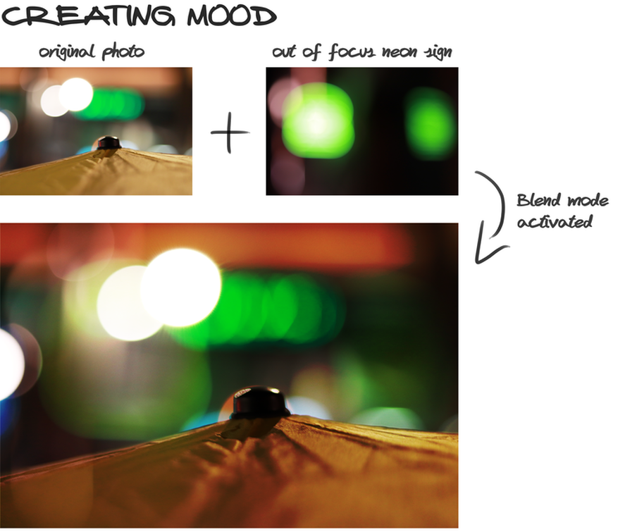
For this photobook, I made sure to head out during the night, this was done to make it easier to photograph the neon colours that leak into the streets because during the pitch-black night is when the colours look most vibrant. Also, I have taken out of focus photos of lights to use as overlays to emphasize the mood within the city. These overlays were added to my content-based photographs using Adobe Photoshop.
|
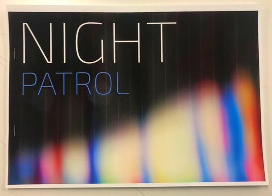
This is my draft for my photobook which I called 'Night Patrol' because it was about revealing London's atmosphere during the night and hinting at what people get up to during these hours.
As stated, the aim for my photobook was to show the atmosphere of London so I made sure to achieve this by taking my photos in shallow focus to visually reflect the variety of unnecessary distractions that surround people and how they have been pressured to adapt to being tunnel-visioned , this is done to amplify the idea that there is a unique tense atmosphere in London that makes Londoners only have enough time to focus on one task at a time, these tasks link to the content in my photos. This content includes photographs of umbrellas, phone boxes, street lights, and people. The core aim of including this content in my photographs has been to reflect the tasks of late-night roamers. For example, the umbrellas reflect those who are rushing to get home as the sun descends and the rainy night begins. On the other hand, there are photos of a phone box that is there to show that there are people who plan to call up and meet with others during the late hours of the day. |
|
In this piece, I combined two of my photos together through the use of blend modes in Photoshop in order to create luminous overlays. This was done to bring out the vibrant colours in my photos whilst amplifying the mood within the busy cities. This process was used on multiple photos to keep a sense of consistency.
|
My set of photos


My photobook-Night Patrol
The creation of my photobook
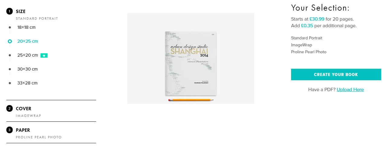
For the creation of my photobook, I decided that I wanted to get my book professionally printed which is why I created my book on Blurb. Firstly, I had to decide the size of my photobook, so I chose 20 x 25 cm because I wanted my photos to work on a double-page spread. Secondly, I chose imagewrap for my cover type because I felt it was the most professional-looking out of the options offered. Lastly, I had to pick between different paper types which I found the most difficult because it was hard to get an idea of the paper quality just through images. In the end, I decided to use Proline Pearl Photo paper because it offered a semi-gloss finish which will allow for the colours in my photos to seem more deep and vibrant.
Cover design process
It was clear to me that for my photobook cover I needed to emphasise the concept of my photobook which was capturing the atmosphere of the city at night. I knew that I didn't simply want to only use a photo of the city since that would be bland and uninteresting so instead, I focused more on the fact that colour played a key role in my book. To begin with, I photographed a painting in out of focus which created a leaking watercolour effect. This painting was a great starting point for my cover because it offered a variety of colours. Next, I took the photo into Adobe Photoshop and changed the hue to get blue and pink and then to further emphasise the core colours I added a blue overlay. After modifying the colours, I darkened 70% of my photo so that the colours from the front lower half would pop out. Finally, I imported a photo of the city I captured whilst I was out late and used the blend mode called colour dodge to create a transparency effect so that it would look like the city is being drowned by the vibrant colours that spill out during the night. My intention with this cover was to show that the colours produced in the city during midnight are more vibrant and vivid than any of the colours you can see during daylight. I am very satisfied with the outcome of my cover as I think it accurately represents the theme of my photobook whilst also being visually pleasing. The title and synopsis will be added using BookWright when I begin working on my page layouts.


My page layouts
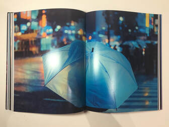
The layout of my pages is the most important aspect of a book because a good layout will encourage viewers to keep turning pages and dig deeper into my photobook. It is vital that my photobook doesn't feel repetitive so to prevent this I added colour pages from time to time to change the flow of the book. Furthermore, I made sure to position my photos differently so that each page would look unique. This was important to me because I wanted to keep my book feeling fresh when being viewed and I knew that if I didn't change the layout throughout my book it would become repetitive and mundane. Overall, I am satisfied with my page layouts as I believe that all my photos could all be viewed individually. In particular, I think my double-page spreads came out very well because they allowed for the viewer to specifically focus on one image and all its minor details that you would not notice if they were sized down. Even though I am satisfied with the outcome of my pages, I still believe I could have improved specific aspects of my layouts. For example, I could have made better use of my coloured pages as some of them seem misplaced like the green page or overused like the blue page. I think I should have only used one blue page as two was unnecessary and distracting.


Final set of photos
These are my final set of photos I used for my photobook which I called Night Patrol. My final set of photos were captured on three different photoshoots between 8 pm-12 pm. Heading out during these hours was important because I needed to take my photos in low-light environments in order to get the most out of the neon signs. The equipment I used for my photoshoots included a Canon EOS 800D and Canon EF 50 mm 1.8 STM Lens. This lens was perfect for my photos because it's a great performer in low-light conditions and can blur out the background in photos so that only the colours are revealed. This is great because my photos will be taken at night so a lens that performs well in low-light conditions is necessary. Furthermore, this lens allows for the content in my photos to stand out because the background will be blurred out due to the low aperture that the lens offers. The content in my photos includes umbrellas, phone boxes, street lights and people which all vaguely reflect activities that take place in the city during the late hours of the day.


Night Patrol
How satisfied are you with the final selection of images for your photobook?
I am satisfied with my final selection of images because I feel like they accurately reflect the atmosphere of London at night whilst also being visually pleasing. However, I would have liked to have taken more photographs, but my plans for photoshoots were cut short due to the lockdown.
Summarise the idea/concept of your book. How well do you think this is communicated to the viewer/reader in the final version?
My photobooks concept was showcasing London's atmosphere at night through colours and the activities that take place. I think my final photobook communicated my concept clearly as I made sure to focus a lot on capturing how overwhelming and tense London is during the night by taking my photos in shallow focus. By taking my photos in shallow focus I would be able to showcase how overwhelming your surroundings can be when you're in the centre of the city by making the background a complete blur. Everything that I do put in focus will be used to vaguely reflect the activities that take place during the late hours of the day. These all play a part in creating London's unique atmosphere which I made sure to put emphasis on.
Identify 2 or 3 of your design decisions (E.g. paper, layout, title, binding etc.) and their impact on the final book.
One decision I made when designing my book was to use Proline Pearl Photo paper for my pages. This had a positive impact on my book as when I received my book the colours in my photos were vivid and vibrant which made a massive impact on the quality of my book. Another design decision I made was to have certain photos on a double-page spread which I believe was the highlight of my book as it enabled me to see all the minor details in my photos which I liked a lot.
If you had more time (and money) what might you change about the finished photobook?
If I had more time, I would have definitely gone on more photoshoots as there were aspects of London that I hadn't explored in my photobook. This would have enabled my photobook to have more of a variety of photographs which would have positively impacted my photobook.
What did you find most challenging about this project?
I found deciding my concept for my photobook the most difficult because I wanted to make sure that my concept would be compatible with my style of photography. In the end, I believe that my style of photography enhanced my concept as they were compatible with each other.
What have you learned about photobooks from doing this project?
I have learnt the history of photobooks and the benefits of using them for presenting your photographs.
What aspects of your completed photobook are you most pleased about?
I am most pleased about how the colours turned out in my photographs as I was worried that my colours wouldn't be as vibrant when printed, luckily this wasn't an issue in the end. I am also pleased about how my cover for my photobook came out as I think its visually pleasing to look at and it also reflects my concept which was my main goal.
